History Of Design

Fall 2010

Saturday, December 4, 2010

Milton Glaser


Milton Glaser is considered the most influential designer and illustrator of the later half on the 20th century and well into the 21st.  Milton Glaser is probably most know for his design of the I <3 NY (see below), but he has done so many more things and continues to create great designs.


He was born in 1929; he attended a high school of the arts in New York, and then went on to study at the Academy of Fine Arts in Bologna Italy. After school Milton became a leader in the founding of the designer firm Pushpin Studios in 1954. He also started the New York Magazine. He finally established the Milton Glaser Inc firm in 1974. Milton Glaser’s work has been widely known and has been seen in many single and group showings at famous places such as the Centre Pompidou in France and the Museum of Modern Art in New York. His work is also in many permanent collections of some high profile museums around the world. Milton Glaser is a special kind of designer on that does not work with one particular idea or meaning. He has done not only posters, but campaigns, environmental and interior design, architectural design, programs, logos, as well as covers for albums. In 2004 Milton Glaser was awarded a Lifetime of Achievement for his work with design by the Smithsonian Cooper-Hewitt, National Design Museum. Milton Glaser currently works as a design consultant for major companies including Target, Julliard, Harvard, and Brooklyn Brewery.

Thursday, December 2, 2010

Bauhaus


The Bauhaus was a German school of art. Bauhaus literally means building house or school of building. The school was open and active between the years of 1919 and 1933. The Bauhaus was founded by Walter Gropius in Weimar. Although Gropius was an architect and then name of the school implies architecture, there was not a department of architecture during the first few years. Gropius wanted a school that brought together all forms of art into one school.
The Bauhaus took place during the years between the fall of the German monarchy and the rise of the Nazis party. This was a period of extremely liberal experimentation in German that lent itself perfectly to the rise of modern art under Gropius at the Bauhaus. Although Gropius never firmly believed in other revolutionary ideas taking place in other places such as Russia, there is no doubt that it probably had a great influence on some of the students. Gropius was definitely influenced by the teaching of William Morris who held the idea that form follows function, art that benefits society, an idea that Gropius brought to the Bauhaus.
The school moved three times during its history. It started in Weimar from 1919 to 1925, moved to Dessau between the years of 1925 and 1932 and finally Berlin from 1932 to 1933. In 1933 the school was closed under pressure of the Nazis. The Nazis party was very interested in keeping with tradition they not only disliked Gropius’ ideas of modern art but they did not like his political stance that they deemed radical.
The Bauhaus had a major influence on art and architecture in later decades. Buildings in the Bauhaus style can be found in abundance in the US, Canada and Israel, where many of the artist fled to after they were exiled by the Nazis party.
The Bauhaus aimed to marry the ideas of the arts and of new technology. Some of the most famous artist associated with the Bauhaus was Paul Klee, Kandinsky, Josef Albers, Marcel Breuer, and Piet Mondrian.
Performance Piece
Bauhaus Chair- Breuer

Sunday, November 21, 2010

Pictoplasma "Characters in Motion - Vol.3" teaser: DVD out now!


Pictoplasma has been around since 1999. It was established as an organization that deals with contemporary character design.  They help to foster design and character development in all mediums and fields of art. Pictoplasma has a very particular style that is heavily influenced by reduced and simplified shapes and forms. The design and projects Pictoplasma deals with are wide reaching ranging from mixed media, design, animation, instillations and fine art works. Pictoplasma has also become its own publishing company providing books, small publications, DVDs, and even gadgets that reflect characters designed by their organization of artists. Beginning in 2004 Pictoplasma has held an annual festivals and conference across the world. Every year creators and producers of character design from all art mediums including illustrators, animators and graffiti artist come together for these conferences. The festival known as Pictopia has artist lectures, screenings of short films, and parties. This year’s Pictopia will be held in Berlin. In addition to Pictoplasmas annual conference they also have exhibitions that are like character instillations, which often include life size characters, plush dolls and cardboard cut outs creating an interactive environment for the viewer. Probably one of the biggest accomplishments of the Pictoplasma group is their large collection of character design in their archives. The Pictoplasma archive collection includes over 20,000 characters designed by some 5000 international artists. All of these designs are all available to be seen online through the Pictoplasma archive website. Providing the designs online allows for a larger audience and a more widespread appreciation of this somewhat new form of design.
you can find their archive at http://pictoplasma.com/

Tuesday, October 26, 2010

Georges De Feure

http://www.trueartworks.com/poster.php/0000-0074

Georges De Feure was a Belgium artist who worked in France most of his life. He was born in 1868 and died in 1943. De Feure is considered a French designer and painter. He was a talented artist who did a variety of things including paintings, glassware, interior spaces, furniture, graphic posters, dishes, and windows. Many of his first commissions were for poster and set designs including the once famous ones done for Chat Noir.
 He met Siegfried Bing who had begun to notice De Feure’s posters around Paris. His posters often depicted sensual women with lofty clothes and soft brown and rose colors. Around 1890 De Feure started to shift his attention away from painting and onto crafts and furniture design at the influence of Siegfried Bing. At this time De Feure also held the position of 'Professor of Decorative Arts' at the École des Beaux-Arts.


Candle Stick
http://www.liverpoolmuseums.org.uk/walker/craftdesign/graphics/large/candlestick.jpg


De Feure along with Eugene Gaillard and Edouard Colonna where chosen by Bing to design rooms for his Pavilion at the Exposition Universelle, Paris in 1990. De Feure designed the boudoir and toilette of Bing’s Pavilion.  After L’Art Nouveau gallery closed in 1904, De Feure began creating what is called vide-poche furniture. Vide- poche furniture makes use of compartments that are often hidden in the furniture. His work in furniture and silverware is very closely really to his work in painting and printmaking emphasizing liner patterns and feminine qualities. In 1928 De Feure was appointed to Professor at the École Nationale Supérieure Des Beaux-Arts and he continued creating art in the art nouveau style.
http://portobello.com.au/blog/images/r_feuro9.gif

Tuesday, October 19, 2010

Chromolithography

Map of Toronto

Chromolithography was the first process of printing that allowed for multiple colored prints. The term now means any lithography print that has color. Before the introduction of chromolithography color had been applied after the printing process by hand.
Each plate of stone or metal leaves an imprint of a different color on the page. One plate is used per color; the stones are applied on top of each layer to achieve multiple colors. If the stones are not applied perfectly on top of one another the color can look fuzzy or just generally not right so the process is very tedious and exact.
The inventor of lithography, Alois Senefelder, had written in 1818 about his plans for using colors in his prints and outlined the process that are still in use for chromolithography today. It was not until 1837 that a patent was awarded for the process. The patent was not even given to Senefelder, and much debate surfaced about the whether or not the process had in fact been widely used before the patent was granted.
Originally chromolithography was used to make advertisements or reprints of a painting. Today most chromolithography appears in the form of a fine art due to cheaper printing process that are currently being used for advertisements.  Although at the height of its popularity chromolithography was viewed as a low form of art partial because it’s tricky and precise process made it difficult to reproduce perfectly, today many people enjoy the visual qualities and uniqueness of these prints.

Wednesday, October 6, 2010

Rococo Fashion

http://www.dirjournal.com/info/the-history-of-coiffure-in-the-xviii-century/
In 18th century France, Rococo sprang up shortly after the Baroque period. Many describe it as the happiness that followed the Enlightenment age. Everything in the Rococo period was heavily decorated with frills to spare, especially the clothes.
 Dresses had winged arms that showed the lace from the under blouse.  Hair was often piled high upon the women’s head but allowed to flow softly in curls down the neck. Many women decorated their hair with ribbons, jewels, feathers, these was the style of Rococo. During the 1720’s and 30’s the Hoop skirt expanded and flattened out at the bottom allowing for even more fabric to train down the back providing more space for pattern. The back of the bodice was pleated so that the fabric would hang more loosely down the back forming an elegant shape. This shape became the subject of many of Watteau’s painting of women during the Rococo style.  He was so interested in the shape these pleats made, that today they are called Watteau pleats. 
Watteau Pleats

http://www.rijksmuseum.nl/aria/aria_assets/BK-1978-248?page=1&lang=en&context_space=&context_id=

The century can be broken down into quarters separated by periods of patterns. The first quarter of the century saw large bold floral patterns; the second quarter took these floral patterns and reduced their size. The third quarter introduced some more linear patterns consisting largely of strips along with an assortment of flora. The last quarter of the century was greatly influenced by fabrics and patterns from Indian culture.

The undergarments of the upper class including the petticoats were generally made from linen. Wool was also used for these undergarments because of their warmth and inexpensiveness; it was the fabric many lower classes used. Silk was the fabric of choice for the outer clothing including dresses and blouses of the wealthy population, being it was very expensive.  Cotton went in and out of fashion depending on time and location as in many parts of Europe cotton was still very expensive to produce. Cotton was even banned from some countries altogether during the Rococo period, these countries included England, France and Prussia. Dyes were used to make the fabrics colorful, ivory, sand, light blue, blue/grey, and pink were the most common colors of dress during the time period. Permanent dyes were not invented until sometime in the 19th century so dark browns and black were very rare.
Clothing during the Rococo period became much more than just a covering up of the body. Much attention was given to every detail to the design of the outfit. Clothing of the Rococo period followed much of the design of the rest of the arts of the time.  Architecture, painting, sculpture and clothes brought about a sense of happiness that had been covered up by much of the art world until this time. Although today many consider Rococo to be a frilly less important time period, it is interesting to see the pleasure of the time between the enlightenment and the period of revolution that followed.
Many in the fashion industry have taken on the ideas of Rococo fashion when designing their latest line of clothing. The film industry has also used Rococo as an inspiration in films like Marie Antoinette, The Duchess, Kamikaze Girls and other similar movies, which place a great importance on costume and design. This short YouTube video shows some modern trends influenced by the 18th century Rococo style.


Tuesday, October 5, 2010

William Morris and the Kelmscott Press

The Wood Beyond the World 1894
http://www.slq.qld.gov.au/whats-on/exhibit/online/tw/Displays/drawn/browse_images_4

William Morris set up 3 printing presses in Hammersmith England in January of 1891. These presses became known as the Kelmscott Press. Morris was heavily influenced and inspired by medieval illuminate manuscripts which had been handcrafted. Morris wanted to achieve a type of printing of early presses, the fine hand crafted style. He wanted his books to be an object of art rather than just a tool. Morris made his own paper and designed his own font types and designed elaborate borders. Burne-Jones, Walter Crane and Charles March Gere did much of the hand crafted illustration work in Morris’s prints. Morris’s books were fine crafted combining work done by hand and that of the printing press; this made his books very expensive but also very beautiful.

Close Up of Above
The Wood Beyond the World 1894

The Story of the Glittering Plain (1891), by William Morris was the first book published by the Kelmscott Press. Morris had originally established the press for his own personal enjoyment. His first prints were made for himself and a few friends. After some success he published nearly 200 to be sold. The Kelmscott Press eventually published some 53 books including ones written by Keats, Shakespeare, Tennyson, and Shelly. Of Morris many published books many consider his The Works of Geoffrey Chaucer, to be his finest achievement.
Morris made three specific font types for his press. The Golden type was inspired by the 15th century printer Nicolas Jenson. The Troy type was a gothic style type inspired by early German printers. The last type he invented is called the Chaucer type because it was used in his publication of The Works of Geoffrey Chaucer. The Chaucer type is a smaller version of the Troy style.
After Morris died the Press continued for 2 years working on things that Morris had already planned but did not undertake any more titles to publish.

Sunday, September 26, 2010

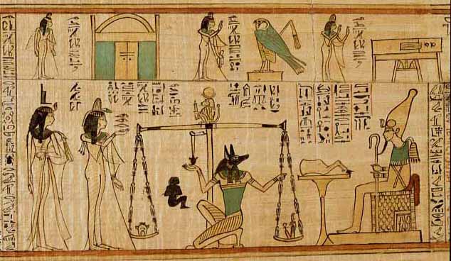
The Book of the Dead

http://www.crystalinks.com/bookdead2.jpg

The Egyptian religion was heavily based on an afterlife. They spent a great deal of time alive preparing for death. The Book of the Dead was a funerary text used by the Egyptians, but also provided the basic concepts and ideals of their religion. It is not considered a bible because it was not from the divine; it was a changing document of their religion. The Egyptians used this book for spells, hymns, and as instruction for the afterlife. The Egyptians believed that there were trials and challenges that one must complete before making it to the afterlife; this book provided the answers to these tests.
The book of the dead was originally in the early Egyptian kingdom carved on the walls of the tomb and later in the Middle Kingdom it was carved inside the coffin itself. By the New Kingdom the Book of the Dead was being written on papyrus or scrolls and placed with the sarcophagus. Although the Book of the Dead was used for the religious purposes of the afterlife it was still popular well into the Roman era. The original books were not written in a specific order or chapter, instead they were organized in order of importance to each individual based on class or family. Later however the book did become more organized into a set chapters of spells know as the Saite version.
The Book of the Dead was published with the help of numerous scribes and artist whose work was put together into one copy. The cost of the book was very expensive so planning for the purchase would have been considered well before the person’s death. During the height of this books importance words were far less significant than the illustrations. Often the words are squeezed in or poorly written, even occasionally having the wrong or misspelled word. The most complete example of the Book of the Dead surviving today is known as the Papyrus of Ani.
The picture above is of one of the trials the Egyptians believed one must complete before arriving at the afterlife. It is the depiction of the weighing of the heart. Where the heart was weighed against a feather to see how much sin the individual held.

Tuesday, September 14, 2010

Runes

http://www.crystalinks.com/futhark.gif
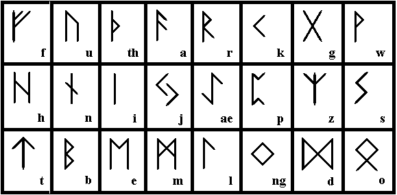
Runes were a Germanic script used before the adoption of the Latin alphabet. Runes were found in hard surfaces such as wood, metal, or stone. There are no horizontal lines in ancient runes which might be because of the surface or tools used to write them. Runes were mostly used from 150 A.D to Christianization in 700 by 1100 had mostly faded into the Latin system but were still used in some specific languages in Sweden until 1800 AD. Surprisingly however in northern Europe runes were being used as late as the early 20th century for decoration.
Runes most likely descended from the Old Italic system of writing. Early runes had 24 characters while the later systems of runes called Younger Futhark had only 16. Runes are divided up into 3 lines of 8 letters called an ætt. Each letter has a specific place within the ætt. For example the S for Sarah is the 8th rune in the second ætt.
The name rune comes from a gothic word meaning secret or whisper, probably because the original use of runes was most likely something for the elite, wealthy or educated. This is why many today believe that runes had some magical or ritual use. However there is no known knowledge that suggests they were used in such a way. Although early runic alphabets may have been only used by the elite or wealthy it has been proven by the Bryggen Inscriptions that later in runes history it was a common writing system. The Bryggen Inscriptions were found in the 1950s and contained 100s of rune writing including letters, personal notes, prayers, and tokens of love.
Although there are more than 5 different kinds of rune variations it is the medieval rune scripts that have widely survived till today. Medieval Runes were used up into the 15th century. The Bryggen inscriptions are of the medieval style. The Dalecarlian version of the rune alphabet was used between the 16th and 19th century, in a region of Sweden. It has been unclear whether or not it was a custom still being used from medieval times or if it was a resurgence of the writing system.
Contemporary uses of runes have are widely for fantasy or fiction. J.R.R. Tolkien invented his own runes called Cirth for his novels the Hobbit and the Lord of the Rings. Hermione Granger also uses ancient runes in the Harry Potter novels. There are at least 2 other modern writers who wrote about runes creating occults based on the ancient symbols. The Nazis used one of these writers’ runes when designing the swastika, which is not an original ancient rune, but fabricated. Some pagans and wiccans have also adapted runes into certain practices and ceremonies, which isn’t surprising because after all Runes originated in the birth place of the pagans in northern Europe.
Runes have been widely studied but are still somewhat a mystery when compared to other early writing systems such as hieroglyphs. While we may now know how to read runes their original use and purpose remains a mystery.

Sunday, September 12, 2010

East Side Gallery


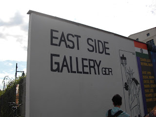
The East Side Gallery was created in 1990 to celebrate the collapse of the Berlin Wall. Some 118 internationally recognized artist and groups came to the 0.8 mile long stretch of wall to communicate in paint their reaction and celebration of the fall of the wall. There are a total of 105 artworks most of wish express the joy and hope for a future much more humane and tolerant. They also express hope for a unified Germany, and hope to be free prejudices. The East Side Gallery is located on the Spree River near the Ostbahnhopf (or east train station); it is the world’s longest open air gallery.


The idea for an open gallery to commemorate the coming down of the wall happened when the artist groups from both sides of Germany the VBK’s and the BBK’s joined together. Over the years much of the wall has been tagged with graffiti or vandalized as well as fallen victim to nature pollution. Many had considered tearing the wall down, but much effort has been made by local community members to keep it in tack. There have been many efforts to restore the Gallery, but the cost proved too much for any major improvements. However, in 2009 the wall underwent a complete renovation just in time for the 20th anniversary of the taking down of the wall. In 2008, 20 of the original artist came to Berlin for the kick off of the revitalization project. The total cost of the project was 2.2 million dollars, most of which came from the EU lottery and other federal German agencies.


The East Side Gallery has now been completely revitalized and renewed, and is in beautiful condition. It has also become somewhat of a symbol for Berlin, with prints of the works on souvenir shirts and mugs, even appearing in movies, and mentioned in the Bloc Party hit Kreuzberg. To many Germans the transformation of the wall into art works is a reminder that the ugly past can transform into a better less prejudice future, if only we remember.


http://www.german-way.com/east-side-gallery-berlin.html


http://www.eastsidegallery.com/historyesg.htm


http://en.wikipedia.org/wiki/East_Side_Gallery